

Upon reflecting on my students’ data I gathered from the questionnaire, the recurring feedback was that students wanted these features in their briefs and LO documents:
- Weighted information (visual structure)
- Examples/ Pictures
- Clear Language (less/ limited academic jargon)
- Simple concise delivery
- Bullet Point delivery
As independent reflection and study are vital to an accessible brief, I think having an additional “TLDR” (Too long didn’t read) addendum template that can be attached to the otherwise successful and well-understood existing briefs explicitly for at-home or clarification reading could be helpful.
I initially imagined a one-page ‘check-list’ / ‘make the grade’ that was graphically designed with all the requirements for the student hand in carefully placed on the document (weighted information, bullet point, ect) as a reusable and editable template. When thinking over the design, I was thinking about what other reliable templates have been made over the years that are focused on being multilingual, quickly legible, concise, and backed by psychological data. Tube Maps! A single universally tried and tested visual map that is explicitly designed to help people around the world know where they are and where they’re going at a glance.
A quick read onto the history of the tube map design proved insightful, designed for the London Underground system in 1933 by Harry Beck to reduce the confusion caused by the geographically accurate system used at the time. Beck was an engineering draughtsman and used the blueprints for electrical circuit boards as his template. He mostly ignored actual geography and focused on legibility, clear separate colours, even spacing between stations and 45 – 90 degree angles.
Pre Beck’s design (1912)
Becks Pocket tube map (1933)
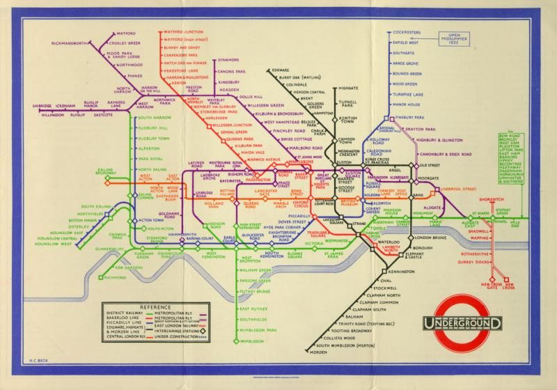
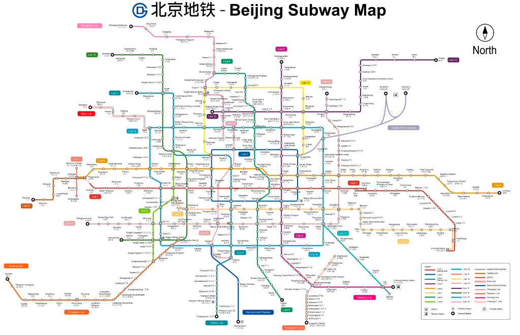
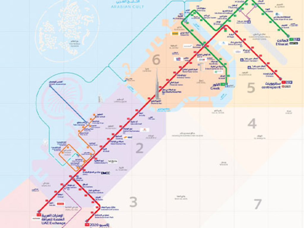
I really appreciate this parallel within my own research; the same information laid out in a simple and ‘pocket-sized’ layout. Beck’s design is considered the Gold standard universally; it is the blueprint used in every major metro around the world, and used in multilingual cities such as Hong Kong, Dubai and Singapore. Minimal language, clear destinations, and visually reassuring to look at, considering the multilingual and global student body taught in UAL I felt anybody from any country would be familiar with the layout and understand what the simple version of the information looks like.
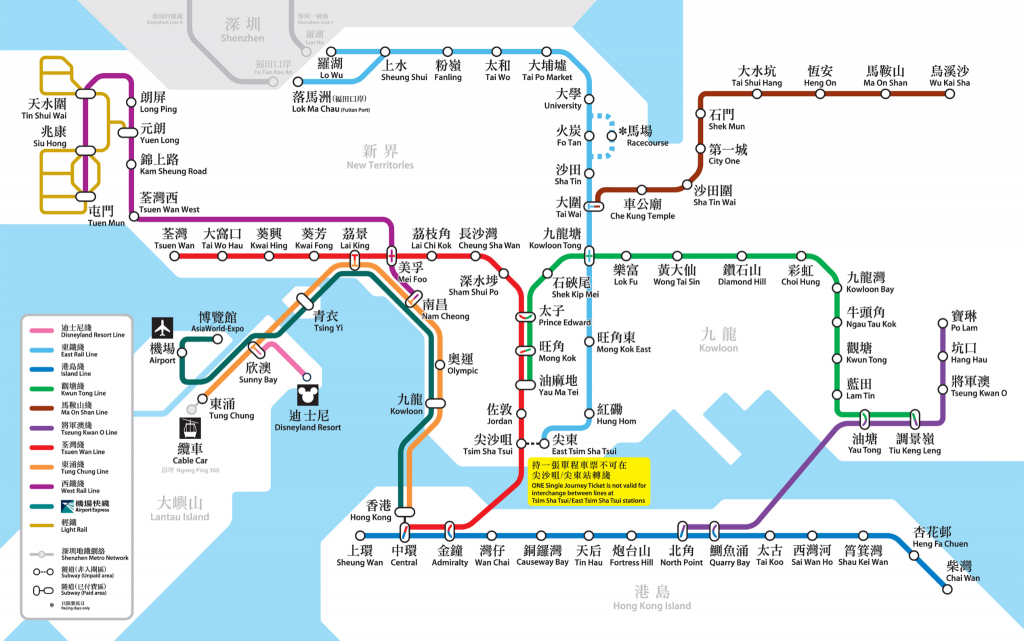
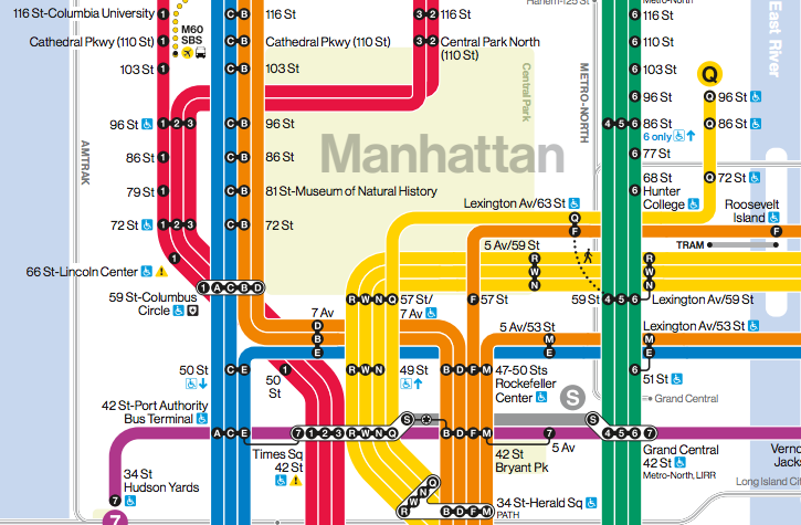
Further research into tube maps around the world;
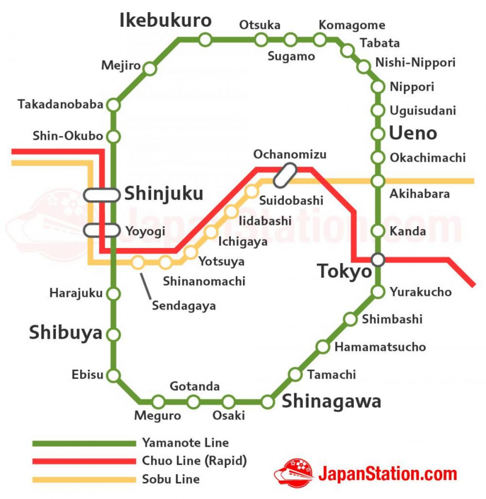
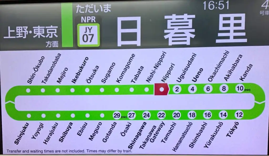
I was tempted to use the green Yamanote line as my inspiration with its little guiding arrows and numeric points, but I fear the circular hoop may be a little too confusing and go off into a conceptual space that is the antithesis of what I’m trying to make. It transpires that actual cognitive research has been done into tube map design and why it’s so useful –
‘Tversky, B. (1993) “Cognitive maps, cognitive collages, and spatial mental models.” In: The Cambridge Handbook of Situated Cognition (Chapter 12)’ Found that humans navigate networks more than actual geography. Metro spatial cognition indicates that humans prefer to know where they are relative to the next stop rather than where they actually physically are in the geography of the city.
‘Healey, C. G. (1996) “High-Speed Visual Estimation Using Preattentive Processing.” ACM TOCHI, 3(2), 107–135.’ Shows humans find a straight line helps to reduce cognitive load, taking out the bendy lines and curves makes the data interpretation much quicker.
The one I find to be extremely relevant here is ‘Neurodiverse-Friendly Wayfinding Design (Dr Paul Symonds)’ which argues;
“Neurodiverse-friendly design refers to environments that consider cognitive, sensory, and neurological differences in users. This approach is helpful for people with autism, ADHD, and dyslexia. It focuses on reducing sensory overload, improving clarity of wayfinding signage, simplifying layouts, and ensuring consistent visual cues. By addressing these needs, though, neuroinclusive spaces also tend to improve and make navigation easier for the wider public, i.e., for everyone, not just neurodivergent individuals.”
When considering the parallels between educational navigation, cognitive load, and my students repeating that they want visual cues and a simple layout, I argue that we can use these studies in an educational setting. Naturally blending them with the explicit research done into actual education settings, I consider that independent travel, whether it’s in a HE setting or a physical journey using visual cues, reducing cognitive load, and focusing on clear, concise travel to the destination, both education briefs and tube maps are a reasonable correlation
Tversky, B. (1993). Cognitive maps, cognitive collages, and spatial mental models. In: The Cambridge Handbook of Situated Cognition, Chapter 12. Available at: https://link.springer.com/chapter/10.1007/3-540-57207-4_2
Healey, C.G. (1996). ‘High-Speed Visual Estimation Using Preattentive Processing’, ACM Transactions on Computer-Human Interaction, 3(2), pp. 107–135. Available at: chrome-extension://efaidnbmnnnibpcajpcglclefindmkaj/https://www.csc2.ncsu.edu/faculty/healey/download/tochi.96.pdf
Symonds, P. (n.d.) Neurodiverse-Friendly Wayfinding Design. Available at: https://travelwayfinding.com/neurodiverse-friendly-design/
London Transport Museum (n.d.) Mapping London: The Iconic Tube Map. Available at: https://www.ltmuseum.co.uk/collections/stories/design/mapping-london-iconic-tube-map
Leave a Reply